

Homely is a digital-based company aimed at first-time homebuyers aged 18-35, working towards the mission of new homeowners taking control of their domestic lives. Homely offer their audience a unique platform to manage utilities, finances, insurances and find tradespeople. The project required market and audience research, a visual identity system including logo, colour palette, typography, and the development and creation of an app. The visual approach of the project uses a bright, vibrant colour scheme to suit the audience with wavy lines as visual elements to represent the process of home buying as a journey.


Homely’s colour palette is bold and vibrant, and the versatility allows multiple colours to be used interchangeably across all platforms and materials. The use of bright, vibrant colours resonates with Homely’s audience, who are more attracted to brands with bold and vivid colour palettes


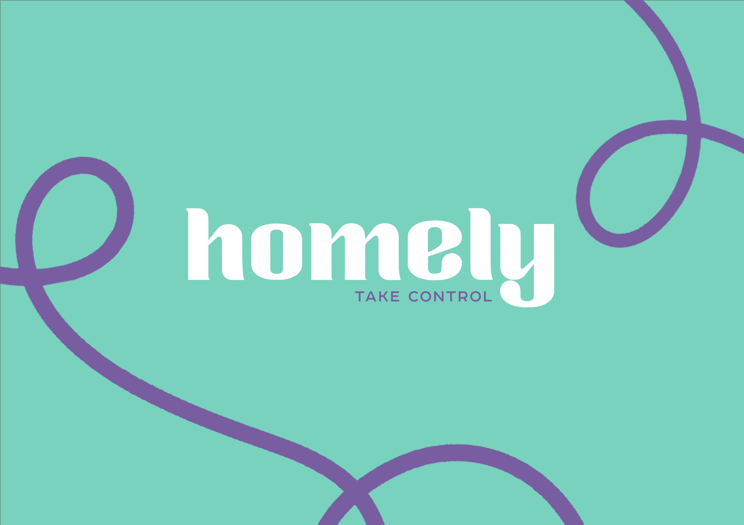
Homely’s logotype is Zoika, a modern, decorative font with subtle curves and minimal serifs. The logotype conveys the fun and dynamic personality by mixing modern and traditional typeface elements, such as the bold weight accompanied by the small flourished details. The primary typeface is Apfel Grotezk, a round sans serif typeface family inspired by neo-grotesque and geometric typefaces. It features easy curves and an exaggerated x-height, granting it a friendly attitude. The round, geometric approach makes it incredibly user-friendly and adaptable for digital platforms.


